top of page

Through The Glass

My art work looks very soft and light but the meaning behind it is rather upsetting for me but its also a big part of me so that's why i decided to make a piece on it. I used color pastels to dust the black and color in the eyes. I used watercolor for the main magnifying glass look and put a shine with acrylic markers. I used yarn to make the vines look more 3D. I did my work based off the anxiety that i have hoping the story behind it will help people understand me and why i am the way i am and also how i'm slowly getting over it. I tried to show some sadness but also some hope because of the amaryllis flowers, vines, and butterflies all  representing growth and improvement + new chapters.The final piece did indeed come out how i imaged it and what i learned from this is that i can be so much more creative with my art. Seeing everyone else's work made me feel a little self conscious but in the end i was still proud of my work because it took me time.

IMG_5504.jpeg
AC38A2A1-89D7-4AE3-8D6B-7B6C3DD2ABEC_edited.jpg
IMG_5506.jpeg

Graveyard


My artwork is somewhat colorful and filled with designs and patterns that come from the character 'Sally' from "Ä Nightmare Before Christmas" I used acrylic paint for the most part but i also used a bit of marker. The main brushes i used were very, very thin. The main idea of my work was the graveyard from the movie in which the main character, Jack, sings his desire for something new meanwhile Sally watches him and feels bad. I also chose this specific movie ad scene because it's one of my favorite movies and favorite songs from the movie as well. The graveyard also stuck out to me because of its unique design. My goal was to make an identical copy to the reference photo i used of the graveyard and i think i partially met that goal. I learned that it'd be easier to use thinner brushes and steadier hands when doing thin patters and designs as shown in the photo. I think the pumpkin kind of came out how i imagined, I know it could've been better but i did put a lot of effort and i'm actually proud of it.

IMG_8052.jpeg
IMG_8051.jpeg
IMG_8049.jpeg

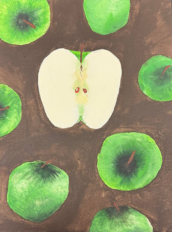
Apples from the past


My artwork is supposed to show the details of an apple and i did this by blending together different shades of green apple green. I used only acrylic paint for the canvas but I did use thin brushes for the details such as the seeds and light green & brown shading. The memory that led me to choose a green apple for this project was the fact that my mom would make me these delicious sandwiches with cinnamon bread with peanut butter and green apples. My goal here was to represent my mom and I in the seeds of the open apple because i thought it'd be really cute and creative. I learned a bit about blending colors together and getting the perfect next shade of a color. The final piece is actually what i imagined but i know the paint job could be better than it is.
IMG_8047.jpeg

Ghoulish Lily

I absolutely love this piece so much, it's literally my second favorite from all of them because it's one I did mostly plan and base off something I like a lot. I tried to be precise with the ink when I was blowing it but I didn't have a ton of control so it was hard and made it look just the slightest bit wonky. The main base off for this spider Lily was from Tokyo Ghoul because It's one of my favorite anime's. I have yet to make anything based off things I really like. My goal was to make it as neat as I possibly could but it didn't quite go as planned but I think it still looks good. Overall, I really really do like this piece for multiple reasons and the main one being that it's based off something I enjoy a lot. 

Cooky Love


My project started as just a plain black hat i got. I decided to only use acrylic because not much else sparked any ideas. I started by making a white base with Gesso and painted on top of that with a light purple to symbolize my mom's favorite group. I sketched the bunny that represents her favorite member neatly and put some of his favorite things around the sides along with some cute swirls that add some more design. I chose to do this specific design for my mommy especially because she's always been the one person I will love unconditionally. Shes my favorite person and i'm so grateful that I get gifts from her every year. I wanted to gift her something special this year so i decided to make it by hand rather than just buy it from the store. My overall thoughts on it so far are that I really like it and I'm sure that my mom will to since she already has so much merchandise but none handmade from one of her kids.

IMG_0104.jpeg
IMG_9998.jpeg
IMG_0028.jpeg

Giraffe In Flowers


I initially didn't have any real ideas or references for my art but I eventually found a photo that I really liked and felt was very fitting for the watercolor and black & white theme. I mainly used wet on wet for my watercolor technique because to me, that fit the most with the background. The reason why I chose a giraffe is because it's been my favorite animal for years now. I have a whole corner of my room dedicated to giraffe stuff. I honestly don't love my art but I also don't hate it. I did put a lot of time and effort into it and I'm genuinely proud of myself for making such a realistic piece since realism is definitely not my specialty. 

IMG_1841.jpeg
girafeeflowers.webp
IMG_1842.jpeg
IMG_1844.jpeg

Ghost Rose

This piece of art has to be my least favorite for obvious reasons. I do really like the technique and its cool for people who actually know how to make something good with it and master it. I couldn't do that so it ended up being my least favorite and least best I guess. My goal was to make a cool smokey rose but it didn't quite go as planned. Although it would look cool with some big adjustments, I don't think its the absolute worst piece ever. I simply wish it looked a little better. My over all thoughts are that I think its ugly and I don't like it and that it could also be way way better as long as I tried a little harder on it. I still like it and am proud to call it mine because it was my first time over all but I still think its really ugly and I need some improvement in that technique.

Gurple


I didn't have a plan when jumping into the paper marbling because I simply wanted to do what I thought of on the spot and see how it came out. I also wanted to stay within a small choice of colors to prevent it looking messy and very mismatched. I did a lot of small amounts of the ink just to be sure it wouldn't mix together and look a mess. The main reason why I chose green and blue is mainly because those have been my favorite colors to combine ever since elementary school. I just really like how the colors complement each other. I really really like this piece because it's my first time ever doing something like that and I used some of my favorite colors. 

Ghoulish Lily

I absolutely love this piece so much, it's literally my second favorite from all of them because it's one I did mostly plan and base off something I like a lot. I tried to be precise with the ink when I was blowing it but I didn't have a ton of control so it was hard and made it look just the slightest bit wonky. The main base off for this spider Lily was from Tokyo Ghoul because It's one of my favorite anime's. I have yet to make anything based off things I really like. My goal was to make it as neat as I possibly could but it didn't quite go as planned but I think it still looks good. Overall, I really really do like this piece for multiple reasons and the main one being that it's based off something I enjoy a lot. 

Opposites Attract

This is my favorite piece of them all because I really like the effect on the other thing I put into the paint. I forgot what it was but I really really like what it did for the paint pour. This piece,, I came into with an idea of colors I wanted and I landed on purple and teal because that was my favorite combo of the few I was imagining on the canvas. My idea for this piece was to make something really really pretty with colors I guess you wouldn't really see around. My goal was to make it very interesting and mesmerizing to look at meanwhile showing the pop of the teal since the purple is really dark. I of course love this painting and it is my favorite from the five that I did. I'm happy with the way it came out fresh and how it looked dry.

Bubbl Track

I am actually not that upset with this piece because I liked how pastel it looks. I used some inks that my mom ordered so I could pull off this technique and it turned out really cute and pastel. I usually don't like this technique because I think it's messy and it never really comes out good for me but this time I liked it because it came out cute. The colors weren't too dark or light, it was perfect for me. My goal for this piece was to make it look as bubbly as possible, meaning I was trying to do it neatly and in a way where the bubbles would pop and the small puddles of ink would mix and ultimately soak into the page, ruining the whole point of the 'bubble art'. My overall thoughts are that I don't hate it but I also don't like it that much. I would put them up on my wall and/or gift to someone.

Hamster Yuji

This piece is one of my favorite characters of all time, turned into a hamster and with a cubism background and hair. I created my art by doing a light sketch of the different shapes all over and pained it with different shades of green and making it fade out on the edge of the canvas because I don't like harsh lines around the edge. I mainly used paint but i did occasionally use water to blend out the color of his fur around his face. My goal for this piece was to make it look like Yuji as much as i could without removing the realistic look of the hamster. My second goal was to make the ultimate piece that I'm proud of and really like more than the rest I've made. Overall, this has to be my favorite and one of the ones i put the most effort into because it had to do with my favorite character of all time. I think he looks cute and realistic. I tried to follow as close to the reference as i could and I think i did pretty good.

IMG_1081.jpeg
IMG_1079_edited.jpg
IMG_2811.jpeg
IMG_1080.jpeg
IMG_2786.jpeg
IMG_2785.jpeg
cubismhamster.webp
IMG_3864.jpeg
IMG_3176.jpg
IMG_4129.jpeg

© 2035 by ELLIE PAGE. Powered and secured by Wix

bottom of page